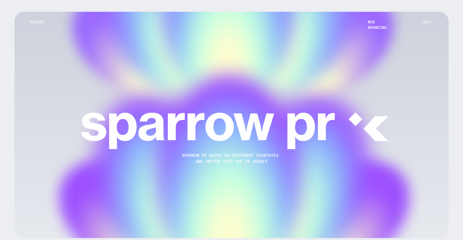
Sparrow PR is an international PR agency with clients and team members around the world
Client’s Goals
Develop an identity that reflects the agency's expertise in working with a wide range of clients, from tech startups to global tourism and lifestyle brands
Project Task
Create branding for PR-agency
Our Solution
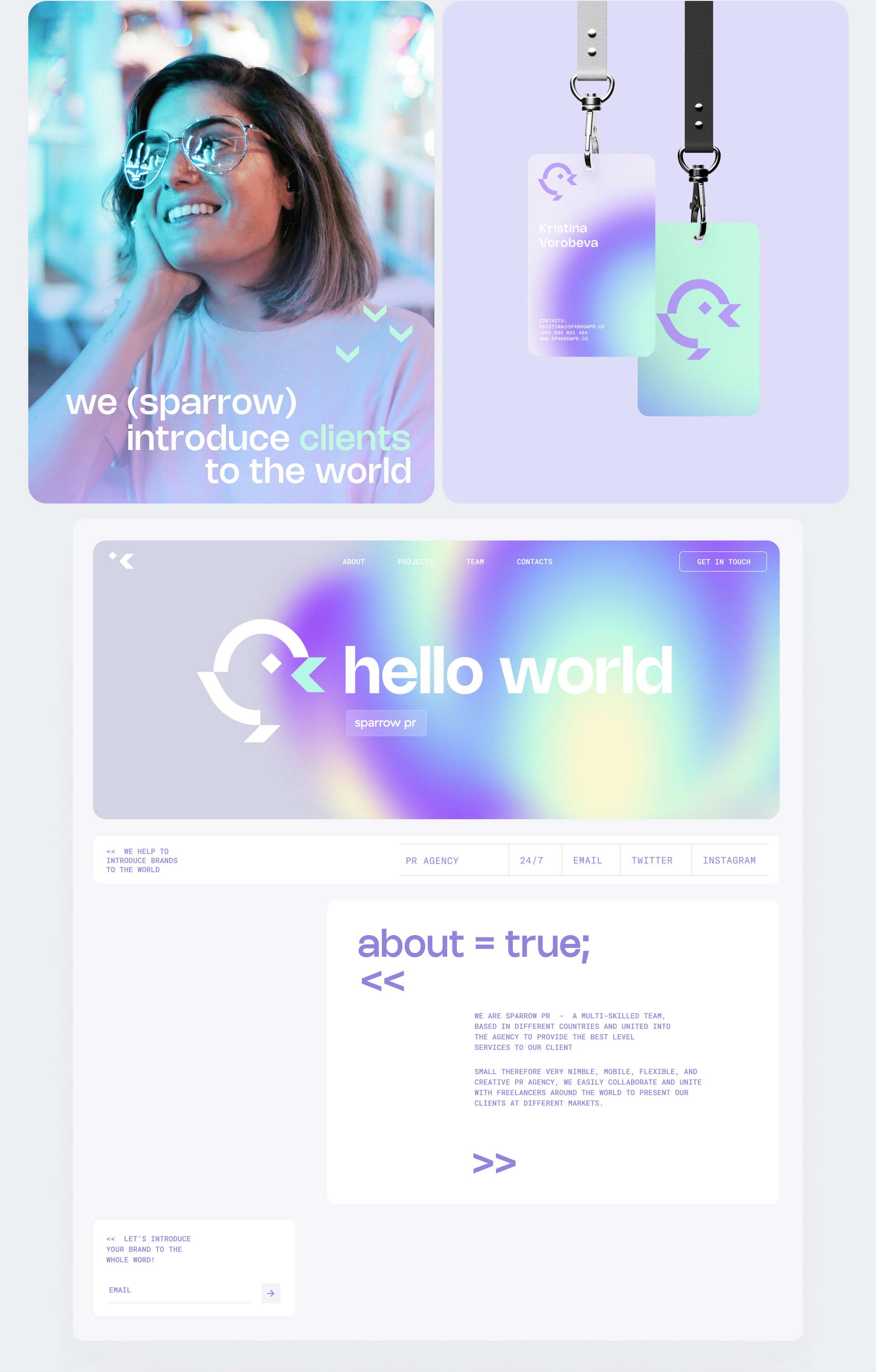
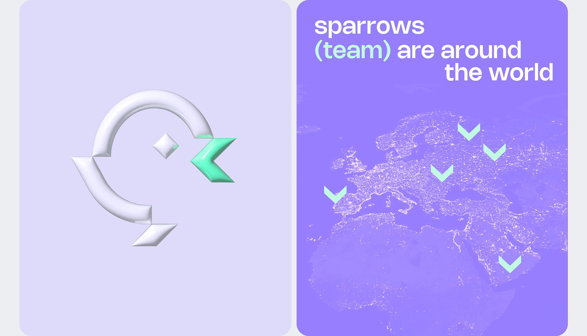
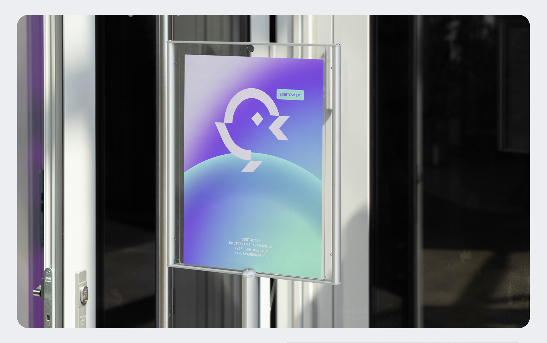
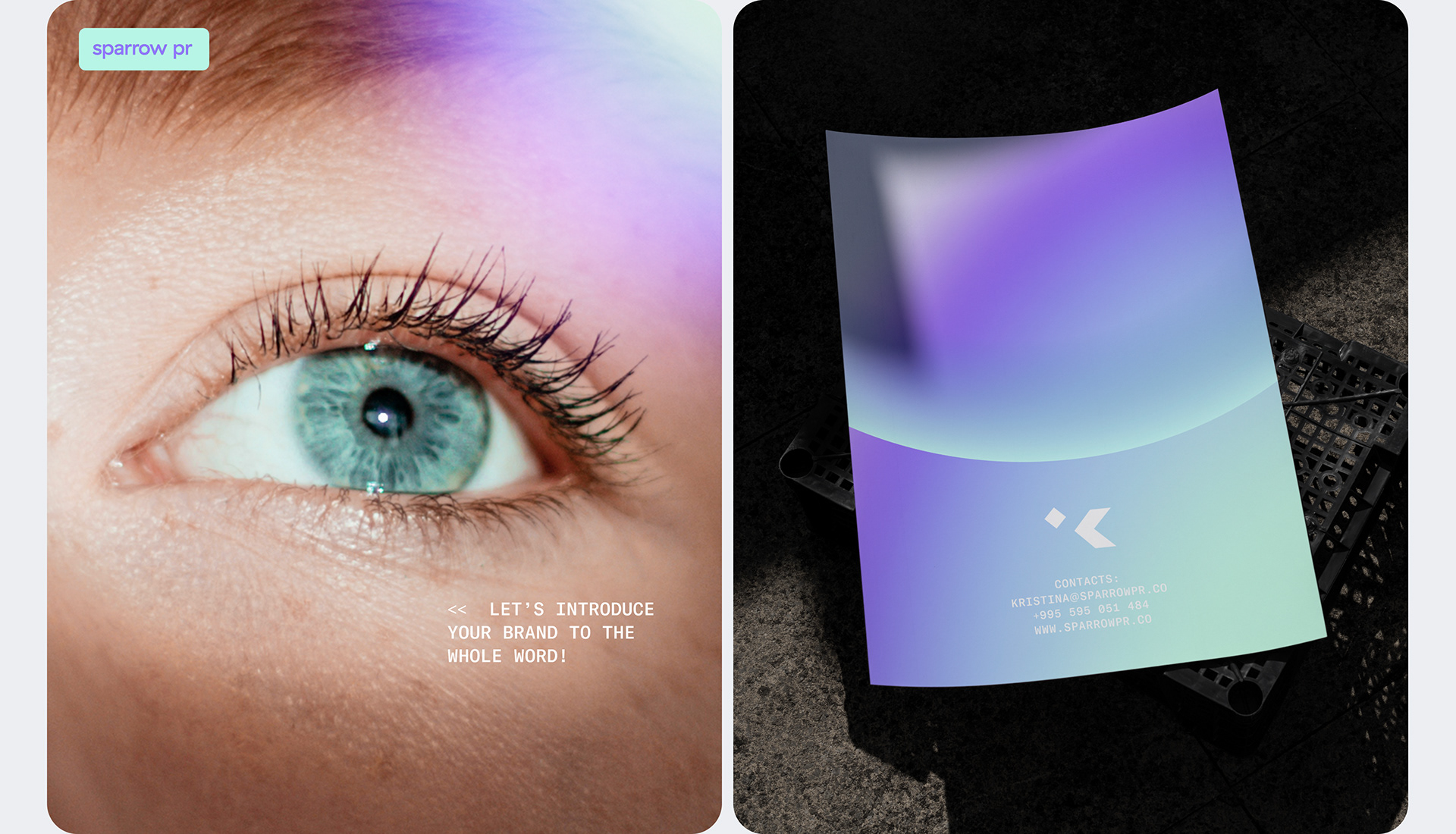
We developed the brand identity, logo, and website for Sparrow PR. The name “Sparrow” was inspired by the founder's surname, and reflects the nomadic philosophy of the company, emphasizing ease, mobility, and the ability to work with clients from anywhere. The logo features a sparrow with a beak shaped like a code bracket, highlighting the agency's expertise in IT. The beak symbolizes the core message of the project: “Spread the word about your brand”. Key elements of the brand style include: - A monospaced, soft, and playful grotesque font - Gradients and 3D graphics - A color palette inspired by Gen Z aesthetics, with turquoise and lilac tones These elements allow the style to appeal to two target audiences: the bracket and tech accents attract geeks and IT professionals, while the soft colors create an emotional connection with a female audience and the B2C segment. On the website, we integrated creative copy with references to IT and programming, emphasizing the agency’s technological focus: <if(sparrow){ <alert(success); about=true;